I searched through my planning notes in my Trai-N-master blog and will recompile some of the key points to be incorporated into this layout.
Here is the dimension of my train room.
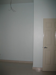
At this moment, this is a utility room. The left wall, as you enter the room, will not be touched. I have cabinets there and they have to stay put. I will need to negotiate with the "land owner" to have that precious real estate space in the future. For now the perimeter of the layout will be 84" (7ft) x 127" (10.5ft) x 91" (7.5ft). It doesn't look like a lot of space. Every time I stand at the main door and look in, I imagine how the big the layout will be. Be happy with what I have now.

Picture 1: Very Important Key - Bedroom # 4 (TRAIN)

Picture 2: Outside Looking In (See What I Mean)
I downloaded Atlas Right Track Software last night and tried to design the Tower 17 junction. Disappointed. It takes up more space than I expected (actually expected). I am going to get some graph papers and work on the track planning and repost.
Update:
Thanks to Stein, he has drawn the layout for me. Here is the rotated view of the room (it is easier for me to rotate the image than for you to rotate your head :D) and the layout drawing.


No comments:
Post a Comment